set.seed(1)
library(plotly)
plot_ly(x = ~ rnorm(1000), type = "histogram")R users fall in love with ggplot2, the growing standard for data visualization in R. The ability to quickly vizualize trends, and customize just about anything you’d want, make it a powerful tool. Yet this week, I made a discovery that may reduce how much I used ggplot2. Enter plot_ly().
For this post, I assume that you have a working knowledge of the dplyr (or magrittr) and ggplot2 packages. I caveat that this post is backed with only 4-5 hours using plotly(), so some statements here may not be fully vetted.
Plotly and ggplot2 are inherently for different purposes. plotly allows you to quickly create beautiful, reactive D3 plots that are particularly powerful in websites and dashboards. You can hover your mouse over the plots and see the data values, zoom in and out of specific regions, and capture stills. Here’s a basic histogram:
After a brief dabble this week in plotly, I realized quickly the many advantages that plotly has over ggplot2.
Several initial impressions:
- Plotly handles multiple wide data columns. I always find it annoying that to color different series in ggplot2, your data had to be in long format. Granted, it takes one simple
melt()command to get the data into wide format. - Plotly also handles long format (see below).
- Customizing the layout (plot borders, y axis) is easier.
- Customizing the legend is easier (in
ggplot2I’ve wanted to remove just one series, which isn’t always easy). - Documentation is better in Plotly.
- Plotly syntax is very intuitive (learning how
aes()inggplot2works is tricky at first) - Plotly also works for Python, Matlab, and Excel, among other languages.
- It’s very easy to add new series and customize them (one line, one scatter, and one bar, for example)
- You can use other fonts (which is possible in
ggplot2, but I’ve never gotten to work on my Windows machine) - You can toggle series on and off by clicking the series name in the legend
Benefits of ggplot2 over plotly:
- Facet wrapping is very easy in
ggplot2. (I think you have to do subplots inplotly.) ggplot2is probably quicker for exploratory analysis.
Converting ggplot2 into plotly
An additional benefit of plotly is that you can convert your ggplot() graphs into a plotly object.
library(ggplot2)
p <- qplot(x = rnorm(1000), geom = "histogram")
p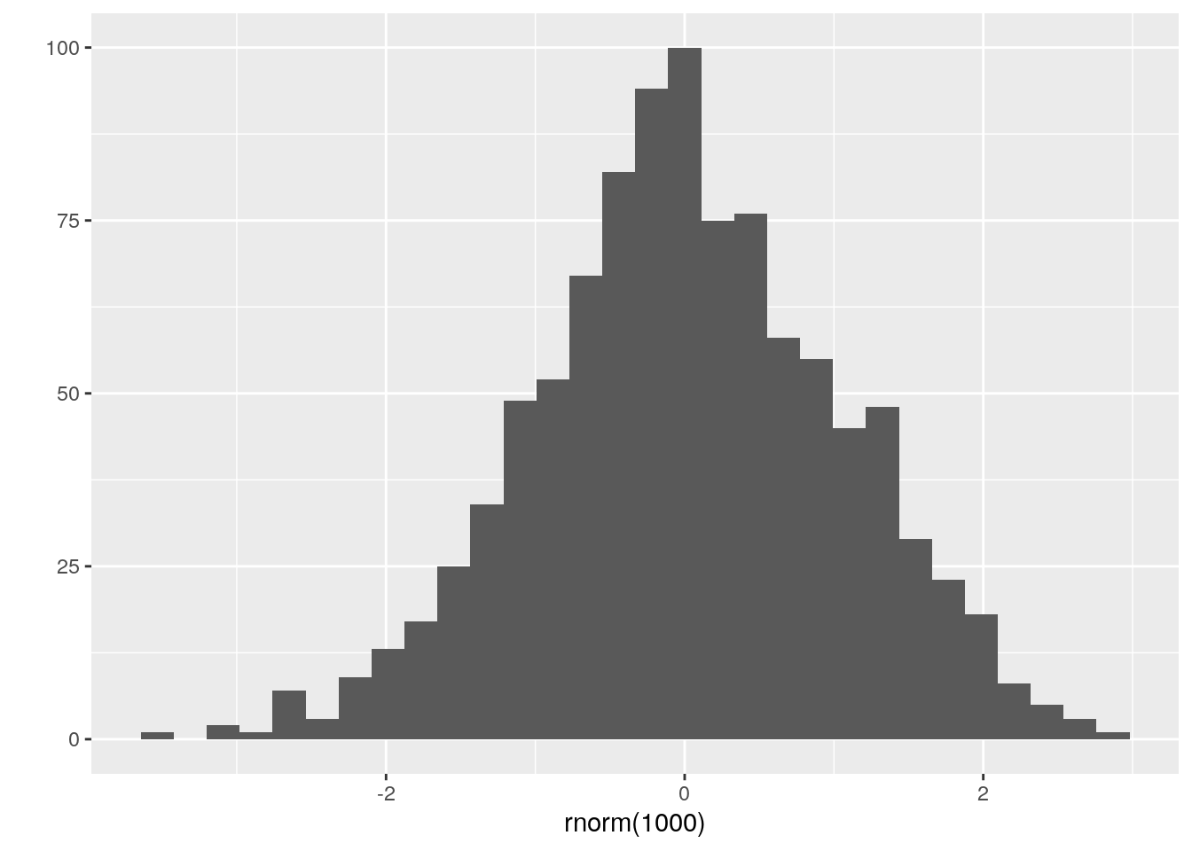
Then, invoking the ggplotly(p) command, we see the transformation:
ggplotly(p)A draw back of ggplotly() is that if you do refined customization (like putting your legend on the bottom of the graph), ggplotly() doesn’t seem to pick this up by default.
# ggplot with legend on the bottom
p <- qplot(
  data = iris,
  x = Sepal.Width,
  y = Sepal.Length,
  geom = "point",
  color = Species
) +
  theme(legend.position = "bottom")
p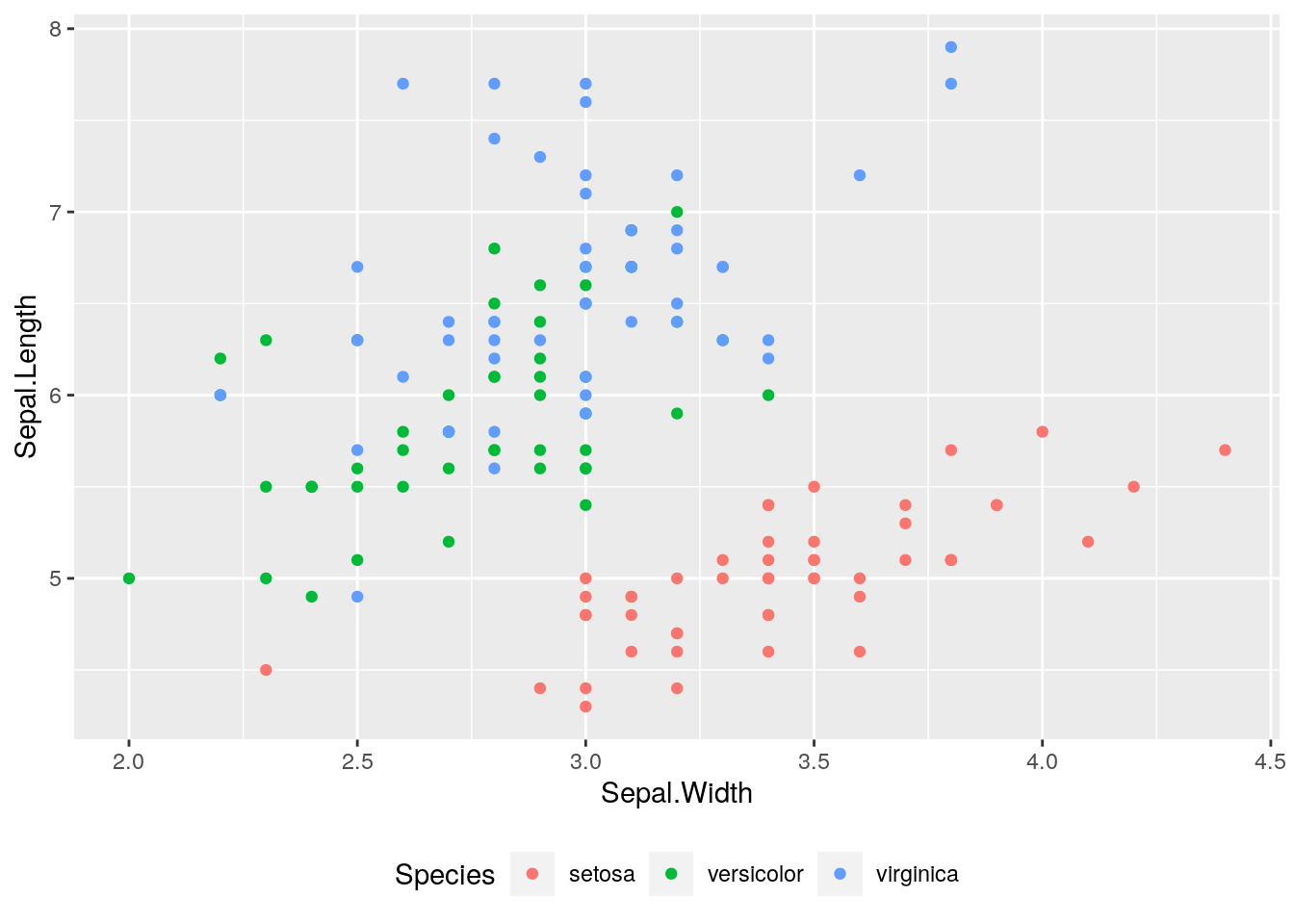
# Plotly doesn't pick up the legend change
ggplotly(p)
But since Plotly also saves to an object, you can use the %>% notation to pipe and add additional plotting commands. This is similar to the + operator in ggplot().
p <- qplot(
  data = iris,
  x = Sepal.Width,
  y = Sepal.Length,
  geom = "point",
  color = Species
) +
  theme(legend.position = "bottom")
p2 <- ggplotly(p)
# Use the plotly layout() command for legend customization
p2 %>% layout(legend = list(orientation = "h"))
The legend doesn’t do exactly what we want, but you can manipulate the legend location manually using x and y coordinates. The orientation = 'h' setting in the docs puts the legend on the bottom for default plot_ly() objects. Graphing the same series, we see the legend at the bottom:
plot_ly(iris,
  x = ~Sepal.Width,
  y = ~Sepal.Length,
  type = "scatter",
  mode = "markers",
  color = ~Species
) %>%
  layout(legend = list(orientation = "h"))
(You notice the Plotly X-axis title can get cut off1, so let’s put that +1 to ggplot2.)
Plotly seems very intuitive relative to ggplot2 in doing layout customization. Things that took me many iterations on StackOverflow to figure out, like adding a black line on y = 0, are built in to Plotly.
p <- plot_ly(iris,
  x = ~Sepal.Width,
  y = ~Sepal.Length,
  type = "scatter",
  mode = "markers",
  color = ~Species
)
# Put legend on bottom, change the x-axis range, and turn on the x-axis line.
# Also, make the zeroline visible, and turn it red.
p <- p %>% layout(
  legend = list(orientation = "h"),
  xaxis = list(
    zeroline = T, # Turns x = 0 on
    zerolinecolor = "red", # colors x = 0 red
    showline = T, # Shows xaxis border line
    range = c(-2, 7)
  )
)
# Or, save parameters into a list. Use new fonts (a huge plus)
f1 <- list(
  family = "Arial, sans-serif",
  size = 18,
  color = "lightgrey"
)
yax <- list(
  title = "Sepal length",
  titlefont = f1
)
p %>% layout(yaxis = yax)
Things I’d like to further explore:
- You can export static plotly images out to file. My hypothesis is that Plotly images take longer to generate than
ggplot2. So if I’m mass producing 30,000 plots (which I had to do last month), which is the faster approach? I would assumeggplot2.
Plotly in RShiny Dashboards
The goal in learning Plotly was for me was to eliminate the Excel-VBA dashboard I created using for my manager. Excel has (some) benefits over ggplot2 static charts: you can easily hover your mouse over a series to see the data value, and most industry users know how to manage an Excel axes. Grated, you can build in an RShiny widget to allow the user to control the axes, but Excel comes with that knowledge base built-in. ggvis allows for the powerful library of Google charts, but I think for a reactive dashboard, plotly is a great way to go2.
So Plotly solved the Excel problem for me. Now my manager can click and zoom to the parts of the graph that are interesting, and hover the mouse to see the values. Just use renderPlotly() instead of renderPlot() in the server.R file, and plotlyOutput() instead of plotOutput() in the ui.R file.
More info here: RShiny and Plotly
RShiny vs Plotly Dashboards
Both RShiny and Plotly allow for creating dashboards. Plotly allows you to build dashboards as well. If you’re just interested in only visualizing charts and trends, Plotly dashboards seem like the way to go. But to build reactivity into your dashboard (like subsetting your sample, changing date ranges, etc.), RShiny still seems like the more customizable solution.
Final thoughts
Overall, it seems that ggplot2 is quicker to build and find what you want. With facet wrapping, the qplot() command, and ggsave(), you can whip something up fast. Plotly is better for dashboards, as you can interact with the plots. I feel like Plotly has a better syntax and documentation, and so it may be easier to get a basic plot to look how you want it to. But ggplot2 seems to have more advanced features, so if you want to get into refined customization, you may want to stick with ggplot2. They’re both great, and serve different purposes, but I’ll be using plotly for my RMarkdown and RShiny visualizations going forward.
_________________________
Bryan lives somewhere at the intersection of faith, fatherhood, and futurism and writes about tech, books, Christianity, gratitude, and whatever’s on his mind. If you liked reading, perhaps you’ll also like subscribing: